Mapping of data for “Changing the Demography”: Violent Expropriation and Destruction of Farmlands in Darfur, November 2014 – November 2015
How to read this mapping of incidents from the data spreadsheet (scroll down to the three maps):
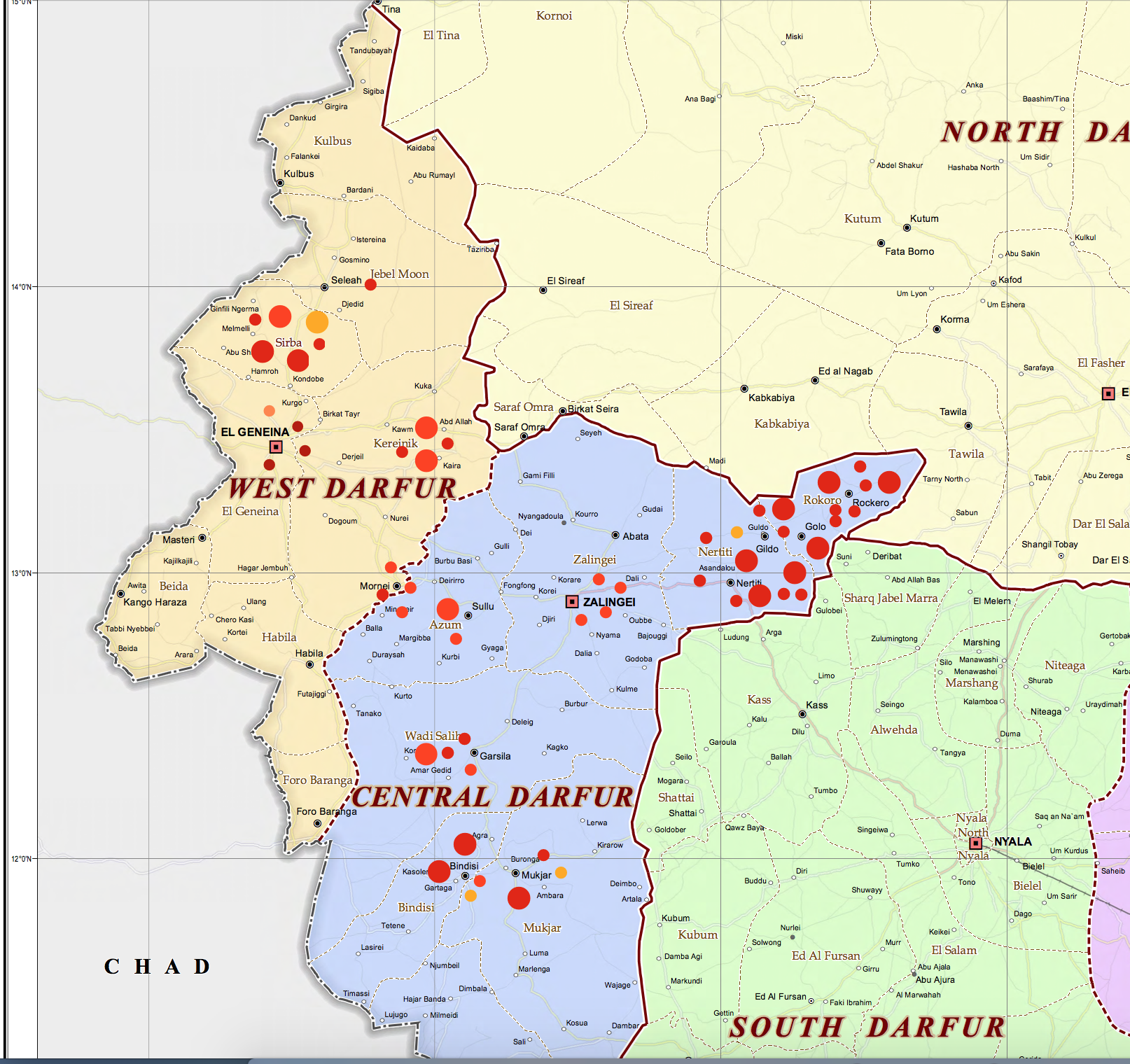
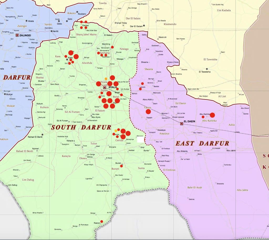
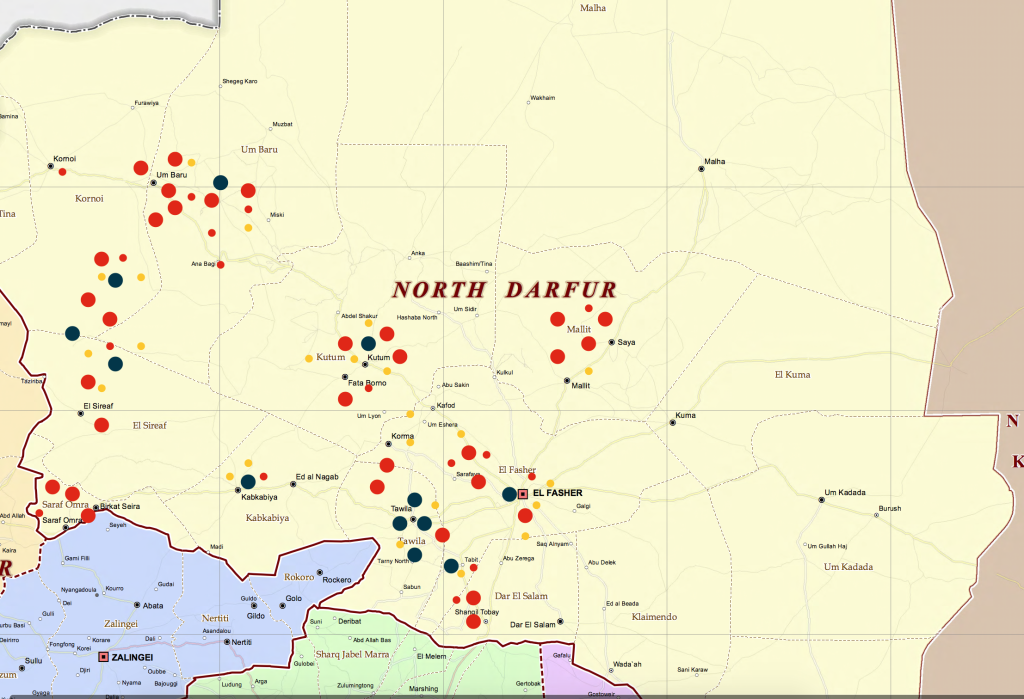
All incidents mapped on this scalable set of three maps (North Darfur, South Darfur, and West Darfur) are drawn from the data spreadsheet and are represented by colored “dots,” of varying size and color. Size and color depend on the frequency and nature of incidents as recorded on the spreadsheet. There are three maps below, although a large majority of events recorded on the spreadsheet occurred in North Darfur. The map of West Darfur includes the so-called “Central Darfur”; the map of South Darfur includes the so-called “East Darfur.” Clicking on the maps expands the dramatically.
Since there are over 500 individual entries for the period analyzed, they could not be individually mapped with clarity, and thus are amalgamated where necessary and the size of the “dot” correspondingly increased as the number and significance of events increase. Incidents have enumerated as well as assessed for size and significance of violence, and this has been factored into the amalgamation of data for particular locations. This is necessarily an imprecise process, but each entry has been individually assessed in the weighting reflected in final quantification by colored dots for given areas, taking into account (for example) the number of women or girls raped; the number of people killed or wounded; number of farms bombed or burned; number of livestock stolen or killed; the number of people displaced. The directness of effect on farms and farmland possession—as well as on the survival of a market economy—is always a consideration.
Scale for mapping events: number of events, reflecting scale of violence:
Smaller red or yellow dots: 1 – 5 events as scaled by number of events and extent of violence
Large red dots: 6 – 10 events as scaled by number of events and extent of violence
Large black dots: represent a total of 50 events as scaled by number of events and extent of violence (this is used only in mapping North Darfur, where violence has been concentrated and would be impossible to use an other means of representation that would retain discreteness of location). Black dots are used for the areas in and around: Eastern Jebel Marra villages; Kabkabiya; Tawila; Fanga (Eastern Jebel Marra); Tabit; El Fasher. The balance of the mapping of events uses red or yellow dots of both sizes.
Red dots indicate a direct relation between violence and land expropriation or destruction or denial of access; orange dots indicate violence with a less direct effect on land expropriation and destruction. Dots are created for a given area, and then amalgamated into larger dots when individual dots become too crowded. (Blue events on the spreadsheet are not mapped.)
The results, if not reflecting an impossibly difficult exact quantification, are a clear indication of where violent expropriation of farmland has been most significant, and where violence threatens farming and farmers and the agricultural economy as a whole, including the very important market network.
WEST DARFUR (click on map to enlarge)
 (WEST DARFUR)
SOUTH DARFUR (click on map to enlarge)
SOUTH DARFUR
NORTH DARFUR (click on map to enlarge)
NORTH DARFUR

